MEDIA 203 - Week 2: Visual Literacy, White Balance,
and Analysis of What Makes a Good Photograph
Visual Literacy
White Balance - Outdoors
Above: Leap Frog Statue and Grain Tower - Sequim, WA
PREEXISTING LIGHTING CONDITION: CLOUDY
PREEXISTING LIGHTING CONDITION: CLOUDY
Above: View of Warren Ave. Bridge from Beach Along Port Washington Narrows - Bremerton, WA
PREEXISTING LIGHTING CONDITION: SUNLIGHT
PREEXISTING LIGHTING CONDITION: SUNLIGHT
White Balance - Indoors
Above: Kitsap Regional Library - Silverdale, WA
PREEXISTING LIGHTING CONDITION: FLUORESCENT
PREEXISTING LIGHTING CONDITION: FLUORESCENT
Above: Buckle (Kitsap Mall) - Silverdale, WA
PREEXISTING LIGHTING CONDITION: TUNGSTEN
PREEXISTING LIGHTING CONDITION: TUNGSTEN
Analysis of Work
Feelings/mood- What is being communicated
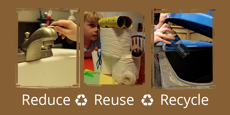
VISUAL LITERACY – All images were taken close to the subject in order to give the idea that the Triple R is a personal call to action. It is a simple practice that can be executed at home. The mood is peaceful, though there is evident action throughout the series.
WHITE BALANCE: OUTDOORS and INDOORS – Images were taken under different lighting conditions (sunlight and cloudy) in order to show how white balance is affected under each condition. In the frog image, the angle of the boy’s back leads into the continued angle of the grain tower roof – a sort of visual sling-shot effect. The bridge image was composed to show a truce between nature and industry as they cross paths. The library stacks were selected for their uniqueness in imagery, commonly understood subject matter, and abundance of titles (although the library in Old Town Silverdale is quite small). Finally, the image inside the clothing store was selected to showcase visual structure in an image which contains many elements to view.
Subject placement - important areas of the images
VISUAL LITERACY – All images in this series have a focal point in their upper portions. The faucet has a drop falling below it (which takes a moment to bring into focus), the craft project has the final product stacked on top of its materials in a pyramid like structure, and the lines in the recycle bin image lead to the hand holding the bottle. F stops are adjusted accordingly to blur supportive elements.
WHITE BALANCE: OUTDOORS – The child/frog placement gives a starting point to the image due to its left justification and the angle leads to the right (since the English language reads from left to right). In the image of the bridge, the curvature of the beach in the foreground leads to the bridge as the subject in the background.
WHITE BALANCE: INDOORS – The corridor-like angle of the library stacks leads to the far wall. Emphasis is given to the left (like the frog image) in order to lead the eye to the back. In the clothes image, the start point begins (again) on the left and is pronounced due to the intensity of the red walls. The proceeding arch, which moves to the right, gives final attention to the subject: the manikin.
Multilayered meaning
VISUAL LITERACY – The Triple R is a clear message that is commonly understood without imagery. The inclusion of the selected photographs reinforce this theme. The dripping faucet is shown to be in the process of being shut off in order to emphasize reducing the use of water, which is commonly wasted at the bathroom sink (tooth brushes are shown in the background as a cause for this problem). The craft project illustrates a repurpose of material that would otherwise be thrown away. Finally, the bottle being thrown into the recycle bin has a background of continued bins – there are plenty of opportunities for recycling so the imagery suggests that there is no excuse to do otherwise.
WHITE BALANCE: OUTDOORS – In the frog image, the boy is not only leaping over the frog, but looks as if he will jump over the building as well. As mentioned in the Feelings/Mood section, the bridge image conveys the intersection of industry and nature, but an alternative location could have showcased this better.
WHITE-BALANCE: INDOORS – The library stacks have a simple idea: an abundance of knowledge. Similarly in an abundance of options, yet different in subject matter, the clothing image presents an invitation to the shopping experience. One addresses academia and the other emphasizes business.
Depth of field - Selecting areas of focus
VISUAL LITERACY – In the faucet image, the background, as well as part of the arm, are brought out of focus in order to give attention to the faucet and the falling droplet. The craft project shows the boy (my Son) slightly out of focus, but with enough clarity to see his concentration through the home-made binoculars.
WHITE BALANCE: OUTDOORS – The concentration was placed on the frog statue, but the grain tower is still in focus in order to demonstrate the relationship of the two elements demonstrated through the diagonal line from the lower left to the center of the top of the frame. In the bridge image, the bridge itself is in focus, but the foreground is still evident in order for the entire scene to be visible.
WHITE BALANCE: INDOORS – The library stacks are in focus and the focus is placed to the upper left in order to create the start point of the image. In the clothes image, the background is out of focus so there is identification of the focal point on the right. The start point is on the left, but the attention is not to remain there.
Light - Sources used to photograph images
VISUAL LITERACY – No flash was necessary. The lighting on the first two images was tungsten. The mirror behind the sink created extra light on the hand and faucet. In the craft project, the overhead room lighting was important and the blinds in the background were closed in order to give clarity to the white balance. Finally, the outdoor image was taken under partly cloudy conditions.
WHITE BALANCE: OUTDOORS – The frog image was taken under cloudy conditions and the bridge image was taken on a sunny day.
WHITE BALANCE: INDOORS – The library stacks were shot under fluorescent lighting and the clothes were taken under tungsten.
According to the instructions, no flash was executed.
Improvement - What would be improved if photographs were retaken
VISUAL LITERACY - To improve the visual literacy project I would have created more harmony in the images either by allowing consistency of lighting in each image or by complete contrast throughout the series. Under the conditions of the first option, I would have taken in the image in a location that has a recycle bin indoors, such as a mall, grocery store, or ferry terminal. However, if I were to select the complete contrast option, either the first or second image would be replaced with another containing alternative lighting.
WHITE BALANCE – The frog and stacks images are fine as they are. However, the bridge image would be improved by an alternative angle since the distance makes the structure seem insignificant. Also, the clothes image would benefit from a more shallow depth of field to further emphasize the shifting focus to the manikin.
What Makes a Good Photograph
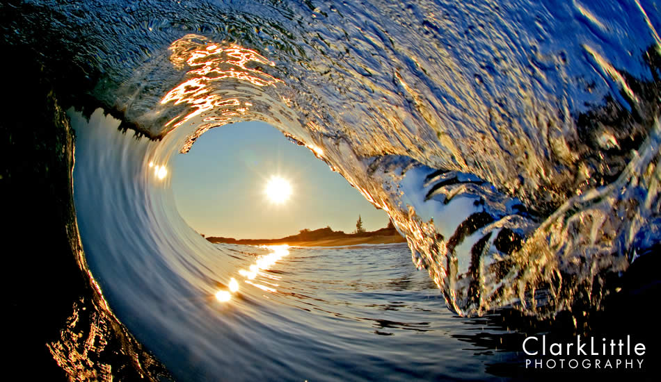
Blue Rise by Clark Little
(Click on image to go to site.)
(Click on image to go to site.)
In choosing an image to analyze from the photography world, I was impressed by the one above for its beauty and visual interest. The photographer, Clark Little, has an expansive collection of images like this, yet each captures its own identity with the changing shape of waves, occasional presence of wild life (sharks, turtles, etc.), different times of the day that images are taken (and thus different color ranges in the waves and sky), and much more. Author Michael Freedman identifies six categories for determining what makes a good photo, which we will weigh against this image in detail.
1) Understands what generally satisfies.
There is a balance of technical expertise coupled with a visual gravitational pull. Technically, the camera position utilizes the rule of thirds and shockingly the horizon is level, though the image was taken while Little was being overcome by a wave. The light is also captured to showcase the scene for its activity and color without the lens getting overexposed, or blinded. Visually, the subject matter is vivid, active, and common enough to be relatable.
2) Stimulates and provokes.
There is a great deal of interest created by an unusual angle of a common subject. Little’s collection is photographed in Hawaii – a popular destination for entering the ocean and immersing oneself in the sun. Waves are easily enjoyed and understood for their recreational appeal and mysticism resulting from an aquatic connection to the rest of the world. However, capturing their glory in an image is a colossal technical challenge. The absence of water droplets on the lens is a key feature in the quality of the picture. One must also consider that there is an unusual challenge to this type of photography: while the ocean as the subject matter is in constant motion, the subject also is constantly moving the camera operator. This creates a great deal of challenge to capture the right position for the right shot at the right moment – everything must be in perfect alignment. In the image here, the sun is centered in the frame of the wave’s crest. The rule of thirds is still evident since this frame is moved to the left. The colors of the evening sun against the blue depth of the water are vivid and show the harmony of color opposites.
3) Is multi-layered.
The image has simple meaning: the awe of nature from a known point of view that is difficult to capture. There doesn’t seem to be any further intention than an appreciation of nature – no social justice, political reform, economic inequality, or any sort of social issue or interaction involved. In fact, there are no human elements – it is nature at its purest. Furthermore, there is no staging to add meaning to the image. The meaning of the image concentrates on a single layer of quality, rather than the quantity of multiple meanings.
4) Fits the cultural context.
Nature is a universal, multicultural subject. On its own, it lacks politics, cultural misunderstandings, prejudice, injustice or any other social disapproval. It represents organic order, purity, and the continuation of life. The ocean is an easily recognizable subject by all cultures – even those that are land-locked since all life depends on water. In this image, the movement of the wave showcases how this life sustaining element has characteristics that give it a life of its own. The ocean has relationships with the sun and shore. It has mood in that the waves can be peacefully minor, playful and athletic (as seen here), or angry in the form of a tsunami. Additionally, just as each person is unique and only on the Earth for a moment, so is each wave. We as viewers are given a unique opportunity to know this wave, though it is now gone.
5) Contains an idea.
We’ve repeated the concept of nature between the multi-layered and cultural sections. Here we are speaking of the thought that went into the image. The subject matter is the same, but the form changes with each wave. Little’s objective is to be prepared for each opportunity that comes his way. He spends his time in the ocean looking for the right depth from the shore (which changes by the minute with ebb and flow of the tide), additional elements (turtles, the sun, a line of trees of building on the shore), and working with the specific lighting of the day. When working at sunset, Little must also be cautious of sharks that come toward the shore for feeding. The main idea is to work with the challenges of the setting, including the wave pushing Little out of position, to get the perfect shot.
6) Remains true to the medium.
Skill in other forms of art is easier to recognize, and therefore easier to praise. Watercolor involves the precision of elegance and does not provide many opportunities for correction. Pen and ink is also unforgiving. Sculptors must create something out of nothing and their product typically aims to be smooth, although carving stone typically produces a jagged form.
In the case of photography, the object is to combine the existing elements in a way that brings the intended showcase of the subject with maximum communication. A painter can create this scene on canvas, but the photography here shows the light of the moment, the purity of water, the welcoming softness of the shore. This scene is real and inviting. It is documented rather than replicated. However, the imagery is visually narrated with light, color, camera placement, and focal length rather than taken as a snapshot. Execution to get the proper position to capture the perfect moment with absolute clarity is an ability that few possess.
